Over the course of the semester I have learned a number of different aspects to Digital Photography. While working hands on with the final project and weekly homeworks I have developed a better understanding of the concepts from this class. Some of the concepts that I have learned over the course of the semester include the quality, strength, and type of light, composition (rules of third, framing the subject, leading lines, point of view), Depth of Field, and Motion through the various shutter speeds. I also appreciate learning how to utilize the different functions on the camera and how they all work together. This includes the shutter speed, aperture, purpose of the lens, viewfinder, image sensor, etc. In terms of my final project, my ideas have changed quite a bit from the beginning of the semester. At the beginning of the semester my idea was to show how technology has changed over time with regard to the automobile industry. But after researching and taking some photos of different cars, I found that idea not to be as interesting. As a result of this, I expanded the idea for my project from cars, to anything that we may encounter in our lives on a daily basis. My ideas for this project were influenced by the rapid pace in development of technology over time and the original idea of the automobile industry. After completing this project I have learned that taking into consideration the different perspectives in which I capture the image make it more appealing. Also when developing the series of images the perspective helps to aid the eye of the audience to the connection between the pairs of images. Another thing is that the way in which the subject is placed in the image is important. I feel that my personal style over the course of the semester has grown a great deal. I can better distinguish a good photo from a bad photo based on the concepts we have learned in class.
Tuesday 30 November 2010


Artistic Statement
The intentions of the series that I have created are to illustrate how things change over time. The emphasis of this series is to bring awareness to some of the things that I stop to appreciate especially while living abroad in Prague. I think time is of an essence and that we move through life so quickly that we do not take a moment to stop and appreciate the small things that we utilize on daily basis. These photos are meant to make the connection from the past to the present in a multitude of categories such as the style of architecture, technology, development of cars, sculpture artistic styles in architecture, and entertainment. Among these categories, I picked certain subjects to include in the photos that I find directly associated with my life and some of which may be connected to yours as well. The subjects in the images are all forms of inanimate objects that are used and developed by human beings. To make the connection between the pictures I utilized the perspectives in which the pictures were taken. My intentions were to show the past and present of each category in pairs of two images. Each pair of images has a similar perspective to make the link between the photos. Overall, I hope that once these photos are viewed, that people will take the time in their day to take a moment to appreciate some of the things that have changed for better or worse in their lives.
Tuesday 23 November 2010


Progress Report Nov. 23
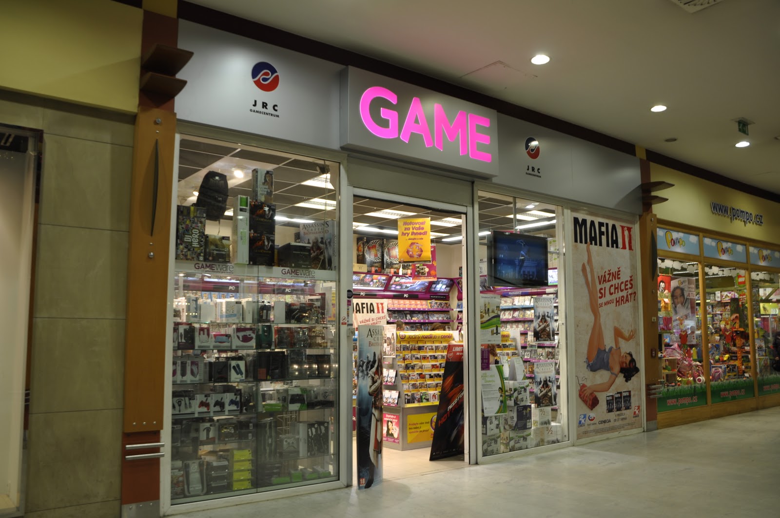
This past week I went to Andel to take photos of the shopping mall there. I tried to capture the automatic sliding doors at the front of the mall in motion with people entering and exiting. This picture would reflect the new technology that we have, specifically with doors. I had some trouble trying to get a good shutter speed. I will post a few of the ones that I thought were thought came out the best. If anyone has any suggestions as to which they like better that would be great. Within the same area was a video game store, which could be used to compare the difference in entertainment from the past, specifically marionettes. I went to old town square as well, and took pictures of two marionette stores from the same perspective so you can see the marionettes in the window. I went to the Intercontinental Hotel on Parizka Street and took a few pictures of the automatic swiveling door there to possibly use instead of the sliding doors at Andel. I also went back to the Astronomical Clock and took multiple pictures of the clock from different perspectives as well as the two clocks on both sides of it. I tried taking close up pictures of the clocks on both sides from below. I will compare this to a new wristwatch and show the difference of technology in the theme of clocks.
Wednesday 17 November 2010


Progress Report Nov. 17
After meeting with Professor Allen last week, I was able to get a better understanding on what I should do with my project. One of the problems I was having was a way to connect two images to each other on the basis of old to new. After class last week I went down to the Charles Bridge and took a number of pictures of the bridge. When I took the pictures I was trying to capture a specific perspective similar to the picture I took of the Brooklyn Bridge in New York. Also when you see the pictures side by side they meet each other because the pictures were taken from two different sides of the bridges. I will post the pictures to better understand what I mean by this. Also when I took the pictures of the Charles Bridge I like that lighting was similar to the picture I took of the Brooklyn Bridge to reinforce the connection between the images. After taking pictures of the Charles Bridge, I went to Kampa Park where Baby sculptures are located. The baby sculptures take a modern approach on the view of society. I will use one of these pictures to compare to my picture that I took from Greece of an old sculpture that was taken from a similar perspective. While I was walking through the park I also noticed near the river there is a walkway and a wall that appears to be old. Unfortunately the wall is full of graffiti but I think that I could possibly use the picture to show the distaste of old things. Over the weekend I took a trip to the Lucerna Passage at Wenceslas Square to take a couple photos the mock St. Wenceslas by David Cerný. Then I went to the original statue of St. Wenceslas located in the center of Wenceslas square in front of the national museum. These two pictures would a direct connection of past to present in style of sculptures. In order to compare the modern technology used in construction to the past I took a photo of a construction site where most of the workers are doing the work by hand. I have a picture of a bulldozer and could use these two images to show the connection. Some of my the photos I plan on taking are a video game shop, a modern sliding door, and a new convertible car.
Tuesday 16 November 2010


Decadence Now Paper
After visiting the Decadence Now exhibition, there were a number of interesting aspects that I found to be conveyed in the artists images. I thought the visit to the gallery was quite unique. The images presented at the gallery were a bit disturbing and not images you would normally see. The setting and the way the subjects were captured distinguish these images.
One of the artists that caught my attention from the museum was David LaChapelle’s art pieces “Amanda Lepore as Andy Warhol”. Being that I am a big fan of Andy Warhol’s art pieces, I liked the way David made a dramatic and unique approach to Warhol’s style of art. The lighting that was utilized in the images was both top lighting. The lighting seems to be artificial and that David possibly used hot lights. The lighting appears to be hard, contrast, and bold. The color of the light is hard to tell because of the bold colors in the background and the subject, but it appears to be coolish white. The subject of the image is positioned right in the center. Although the perspective of the subject was take straight on because it is a portrait. The subject who is suppose to be a mimic of Marilyn Monroe neck is leads you to her face in the image. It appears that David painted certain parts of the photo such as the shading and the make up around the subject’s ideas, which I find to be a clever strategy in his work. To mix painting and photography together I think is a great approach and I like the way it comes together in the image. Also the subject who is a similar to Marilyn Monroe lips and nostrils of her nose seem larger in proportion to the rest of the face. I think he was trying to convey a message from this. The images seem to dramatize what we see as beautiful or attracted to in society. Also I think the image illustrates how some woman try to change their appearance to look like someone else with the use of plastic surgery. The picture is placed in the context of other pop culture pictures. I think that David’s images still connect to all the other images in the gallery because it has not the norm of appearances and is a bit chilling. Overall I like David LaChappelle’s images and the way he depicts pop culture.
Another art piece that stood out in the exhibition was “Elegance and Perversity” by Erwin Olaf. This image is supposed to be a picture of Princess Diana. I love the quality of detail in the image. The lighting is front lighting and looks like Erwin used artificial light. This is seen; if you look at the subject’s eyes you can see that there is hot lamps. The color of the light appears to be about 5,500 Kelvin, which is a cool white. The subject, Princess Diana is positioned in the middle of the picture. I think that Erwin did a nice job of using rule of thirds and leading lines in this picture because the subject’s arm is placed in the bottom right corner and leads the viewer to the subjects face. Also there is even distribution of the space around the subject. The part of the image that even jumped out at me was the Mercedes Benz emblem that punctured her arm. This was most likely done because the car she was driven in before she died was a Mercedes Benz. Also the blood in the image is placed in just few certain places and not shown all across her body. This is interesting because it is laid out evenly and looks like it was placed in certain areas while the rest of her body is untouched. I thought the meaning of the image was to show Princess Diana posing maybe after she died. But after looking on Erwin Olafs website, he mentions that this collection of photos was “…depicting the vengeful nature of members of the aristocracy who have suffered unsavory deaths.” (Biography, erwinolaf.com) This supports my assumptions as to the meaning of the image.
Overall I think these images two artists both captured two very famous people in different ways to convey different messages. I think that they both artist utilized some of the qualities we learn from class and did a nice job of presenting there image.
Saturday 13 November 2010


Tuesday 9 November 2010


Progress Report Nov. 10
Unfortunately this past week has not been in our favor with the weather. Luckily enough, I was able to get a spark of sunlight today and took some time to go around and take some pictures that I could potentially use for my project. I was able to take capture some interesting photos at Malostranska. I continued with the same method of taking pictures with the focus on taking pictures from different perspectives to allow for the picture to be more interesting. For instance, I went back to Starbucks where I took the previous picture that I included in my prior collection of 25 photos, and took a photo of the same object but from different perspective which in my opinion is more attractive. Rather than just looking at a picture of a door straight on your seeing it from an angle. This picture which I will post up as well I may use as one of my images to for the comparison of doors for the old. Also took a number of photos of the St. Nicholas Church. I focused on the top part of the structure like the clock. I thought this could be used in my comparison of clocks. I really liked the image of took of a lamp within starbucks that I thought could be used as a new light. The way lamp is projected in the image when its active was really interesting. I also I had a photo of the tram in the collection of 25 photos that were posted and thought that it would be interesting to take a picture from within the tram while in motion while looking out which could create the effect of the tram moving pretty quick. This was done with a moderately slow shutter speed.
Tuesday 2 November 2010
Progress Report Nov. 3
Today I went around and took a number of photos that I thought could be used as to portray the past/old architecture. I tried to take each photo from different perspectives that would be attractive appealing to the viewer of the image. I believe this worked out pretty well when I took photos of an old light post next to the Opera Theater. I also went to Jindrisska, the tram stop after vaclavske namesti and found an interesting old clock tower.
Subscribe to:
Posts (Atom)